

Data is a powerful tool that empowers organizations to conduct analyses, recognize trends, set realistic goals and make informed decisions. However, with all the data that a company may have to be successful, it can still fail if that data are not properly understood or leveraged.
Moreover, data and understanding the data can be an alien concept to many people in the organization outside the analytics team. This is where data analysis and visualization tools come in handy.
Using these tools, data professionals can take raw data and turn them into something that can be interpreted easily.
In this article we will find out about what data visualization is and about its importance. Additionally, we will also learn about top data visualization tools for business professionals.
Putting it in simple terms, data visualization is the process of creating a visual representation of the information provided by a set of data.
There are numerous ways of data visualization and some of them are:
Data visualization makes it easier to draw meaning out of the data. As such, visually depicting data is an effective way of making data more accessible throughout the organization.
Moreover, this enables the employees to back their actions with concrete information instead of relying on assumptions. This in turn results in a more data driven organizational process.
Furthermore, data visualization is important in communication with parties outside of the organization as well. These parties can include the media, regulatory agents, investors among other stakeholders.
To reflect upon the importance of data visualization, it is important to mention that several organizations are hiring individuals proficient specifically in data visualization.
Data visualization tools are software that is designed to visualize data. Although, the capabilities of the tools may vary according to the tools, but basically, they allow you to input dataset and manipulate it visually.
Most of the data visualization tools come with built-in templates that can generate basic visualizations.
Honestly, Microsoft Excel is a spreadsheet software, not a data visualization tool basically. Given that Microsoft products have been used at the Enterprise level for a very long time, so you might have come across it.
Nevertheless, Excel has some useful data visualization tools. According to Microsoft, Excel can be used to design at least 20 types of charts.
Although there are limitations to what you can create in Excel, your organization can find a more powerful data visualization tool within the Microsoft Ecosystem.
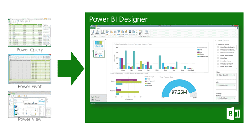
Microsoft Power Bi can be a viable option for the same purpose. It is built specifically for data visualization and analytics. Not only this, Power Bi can also import data from various sources and can give output visualizations in several formats.
Zoho Analytics is a data visualization tool that contributes to visualizing business intelligence. Commonly, it is used to visualize information related to marketing, sales, revenues, profit, and pipelines, that are displayed in user-friendly dashboards.
Furthermore, there are many paid options as well, depending upon your needs. However, you can use the free version if you are looking to only test the waters for determining the suitable tool for your organization.
Infogram is another popular data visualization tool that can be used to generate reports, charts and maps.
The quality that sets Inforgram apart is, you can create infographics. This makes it one of the most popular visualization tool among creative professionals.
Additionally, it is easier for beginners as it comes with drag-and-drop editor. It can also save visualizations in image formats that can be embedded in documents and reports used online.
Like most of the other tools on this list, Infogram also has tiers that range from free to enterprise-level and they are priced accordingly.
Google Charts can be a popular free option for professionals interested in creating interactive data visualizations that live on the internet.
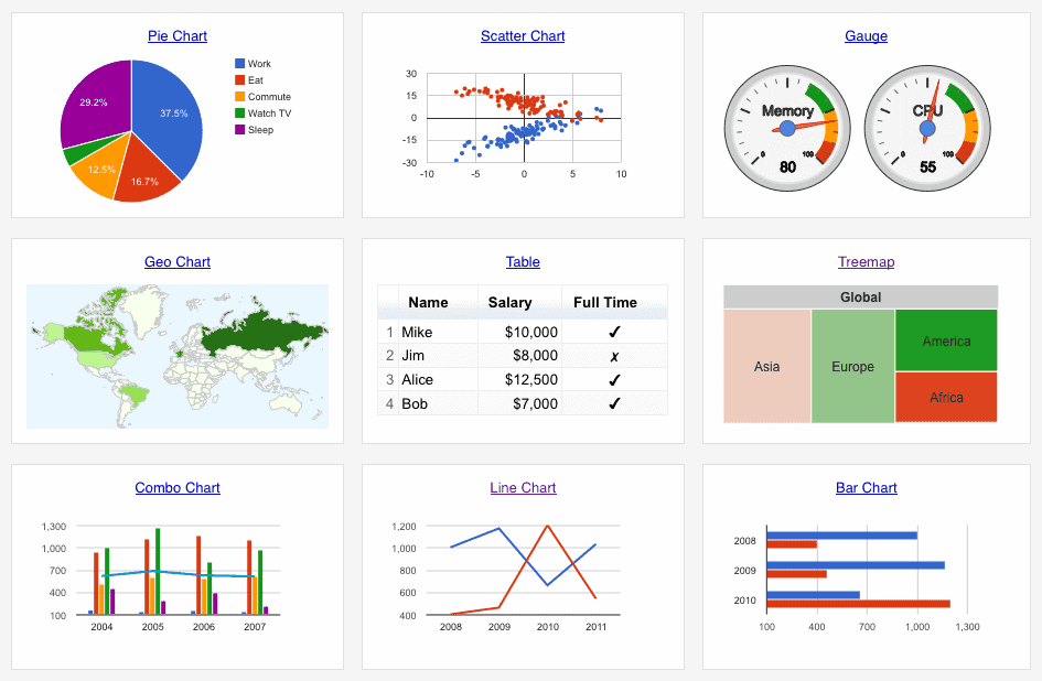
To generate charts, it can pull data from various sources like SQL databases, Google Sheets, Salesforce. In addition, this tool provides 18 different types of charts that can be used to visualize data.
Data wrapper is similar to Google Charts in a sense that it can also generate maps, charts and other graphics that can be used online. The tool was originally intended for reporters working on news stories, however, any professional from any field can draw benefit from it.
While Datawrapper is easy to use, it’s somewhat limited, especially compared to others on this list. One of the primary limitations is that it doesn’t integrate with data sources.
You have to maually copy and paste data into this tool, which can be liable to error and also is very time consuming.
Sign up to stay updated with the latest insights, news, and more.